The Salties
Logo and brand identity for a modern restaurant with a playful and feminine vibe.

Fresh
Simplicity
We developed a clean and characterful brand identity for The Salties—combining a minimalist logo, playful colors, and soft typography to reflect its approachable and stylish restaurant concept.
The Salties approached us in 2024 as they prepared to launch their restaurant concept. They envisioned a brand that feels simple yet modern, with a hint of feminine charm—something that would stand out visually but still feel approachable and warm.
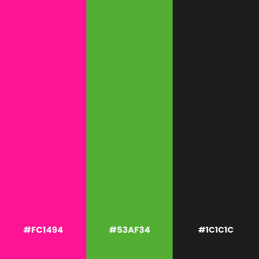
We started by crafting a minimalist logo that reflects a calm and confident tone, balanced with soft shapes and curves. The chosen color palette—featuring shades of pink and green—was designed to bring freshness and personality to the brand, while staying unique among other F&B brands.
Typography played a big role in elevating their visual identity. We sourced a typeface that’s both readable and stylish, giving The Salties a clear voice across all touchpoints. Supporting this were custom brand patterns and asset elements that added visual texture and flexibility for future use.
In addition to the logo and visuals, we designed a brand guideline, A4 stationeries, uniform concepts, and a set of practical branded materials to ensure consistency across their communication.